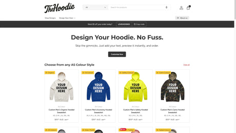

When it comes to customising hoodies, the right font choice is crucial. Unlike digital screens, fabrics introduce unique challenges that must be considered to ensure your design is both attractive and legible. Let's explore how to select a font that enhances your hoodie’s design, with a focus on spacing, weight, and overall readability.
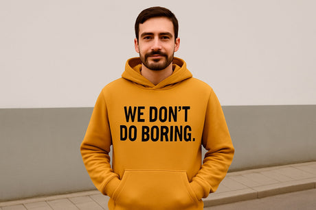
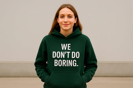
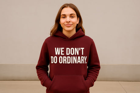
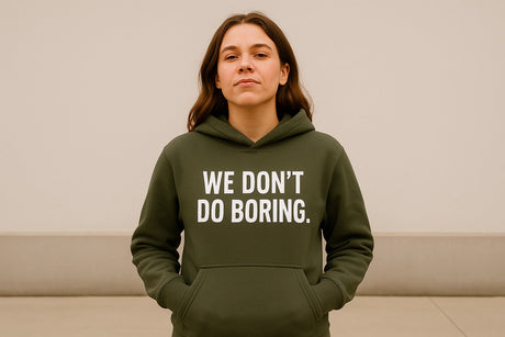
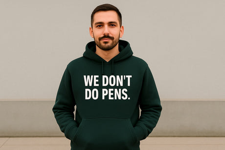
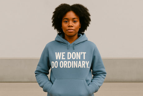
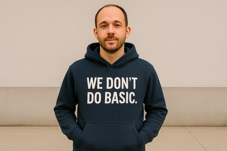
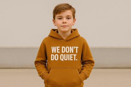
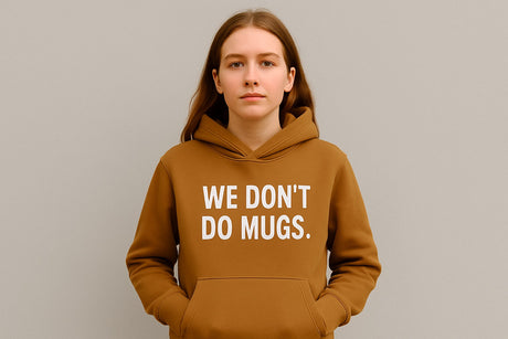
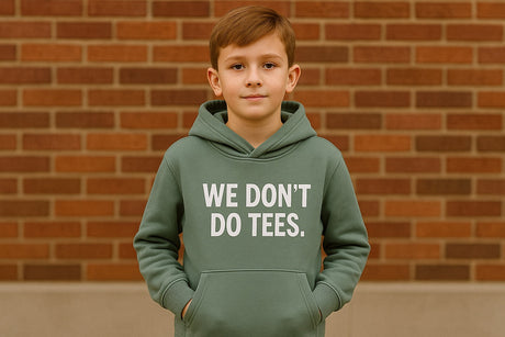
One of the most important elements to consider is legibility. The material can affect how text appears, so it's necessary to choose fonts that maintain clarity. Sans-serif fonts are often recommended for apparel because their clean lines and simple structures translate well onto fabric surfaces. Fonts such as Helvetica or Arial can offer excellent readability, even from a distance, making them perfect for designs intended to draw attention.
Weight plays a significant role in how the font will appear. Too thin, and your text may not stand out, especially if the hoodie fabric is textured or has a vibrant pattern. On the other hand, overly thick fonts can look clunky and might bleed into the fabric, losing detail. A medium weight often strikes the right balance, offering visibility without overwhelming the design. It's important to test how different weights look on samples of the fabric before finalising your choice.
Spacing, or kerning, is another vital factor. Proper spacing ensures that letters don’t bleed into each other, maintaining the integrity of the text. On hoodies, where the surface can stretch, ensuring adequate spacing can prevent the text from appearing distorted or crowded. An over-tightened kerning might cause letters to merge into an indistinct blob, while too much space can break the cohesiveness of the message. Aim for a balanced approach that maintains uniformity and clarity.
The scale of the text also matters. Hoodies are often viewed from a distance, so it's crucial to scale your text appropriately. Larger fonts can make an impactful statement, while smaller fonts require close proximity for clarity. Test your initial designs from varying distances to ascertain the font size that performs best for your particular purpose, whether it's a clear, bold logo or a meaningful tagline.
Finally, consider the aesthetic and brand message. The font should align with the emotional tone of your product or message. For a playful vibe, a rounded or whimsical font might be appropriate. For a more formal or luxury appeal, a serif font like Times New Roman can convey sophistication. Ensure the style of the font complements your design ethos and the expectations of your audience.
Selecting the right font for hoodie designs involves a combination of aesthetics, practicality, and readability. By paying attention to factors such as weight, spacing, and scale, alongside the unique characteristics of fabric, you can create a design that is not just attractive, but effectively communicates your intended message. Choosing wisely is essential for making a statement that resonates, ensuring your custom hoodie speaks volumes.